Hands-on with Apple CarPlay
This week I have had the opportunity to try CarPlay, Apple's version of iOS for your car. It was remarkably easy to setup and use, and a major improvement to any in-car entertainment system. I was driving a 2018 Ford car (in Ireland) which comes with CarPlay compatibility.
Bear in mind that not all cars are CarPlay ready- my Ford was a 2018 model and came with a built-in touchscreen. This is not always standard in Ford cars- you may need to have a special add-on pack added to a new car to be able to use CarPlay. But all Fords with the touchscreen technology do include CarPlay as standard:
Setup:
Plugging an iPhone into the USB port on the central console brings up the following two screens on the 8" touchscreen:
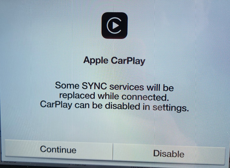
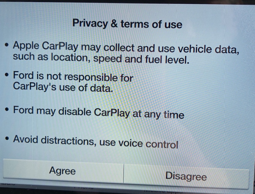
Having chosen to continue, and agreeing to the conditions, you will see this on your screen:
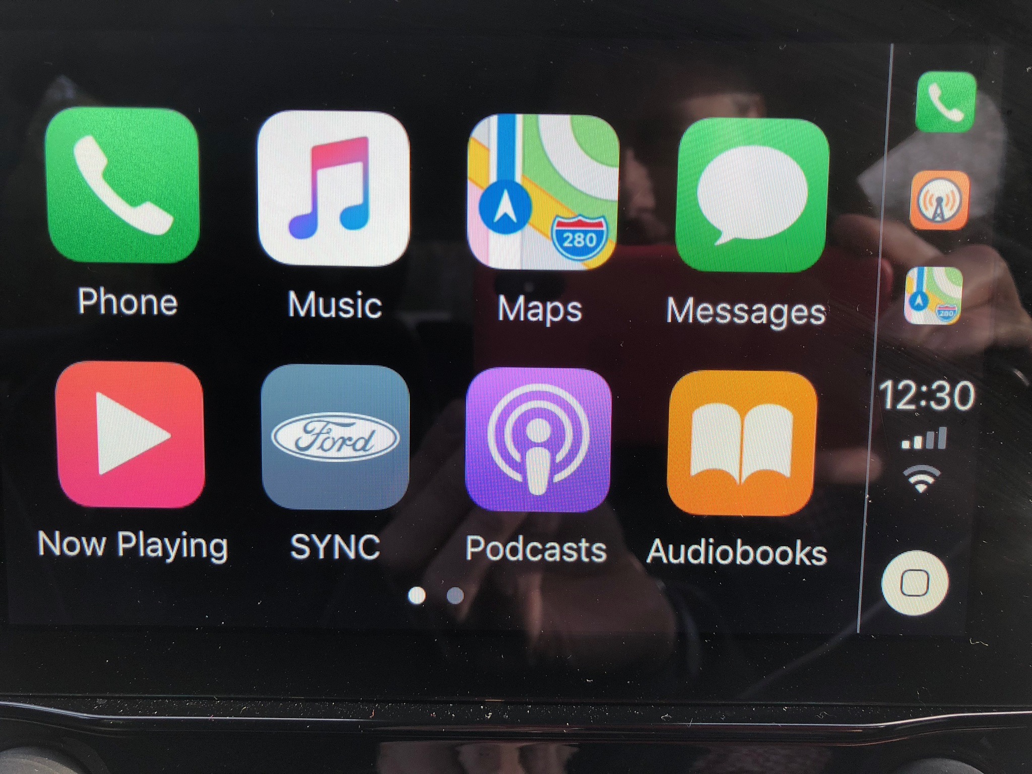
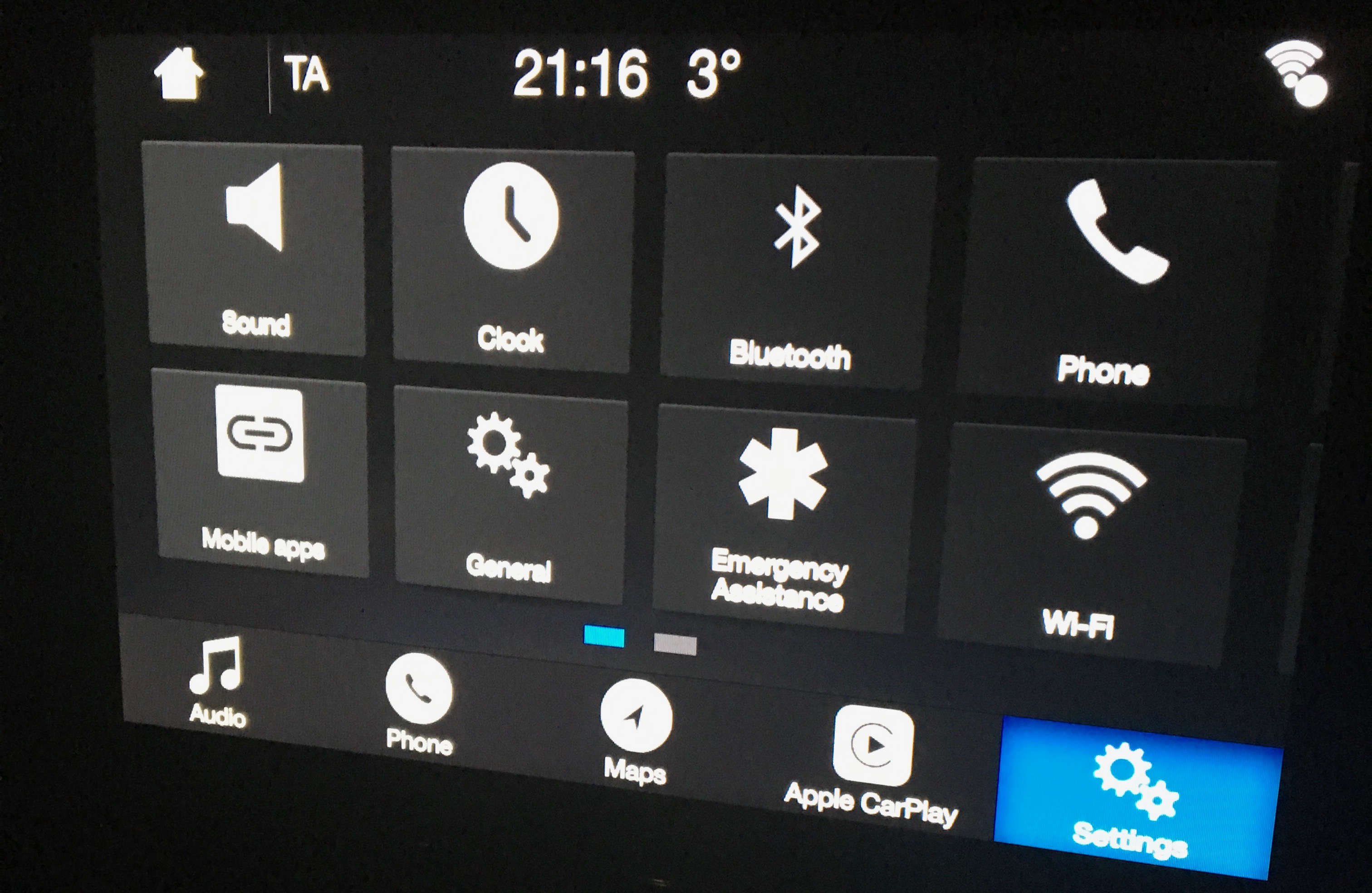
The iPhone will ask you if you wish to accept the link (this question appears automatically) and then the CarPlay Home screen appears on the car touchscreen. In the future, plugging in the phone to the USB port always takes you to this Home screen.
Immediately, the experience is both reassuring and familiar- the touchscreen behaves like an iPhone or iPad; touching an app to open. It is simple and clear to use, with big buttons and large text. The Music app has all of your iPhone music, plus works great with an Apple Music subscription:
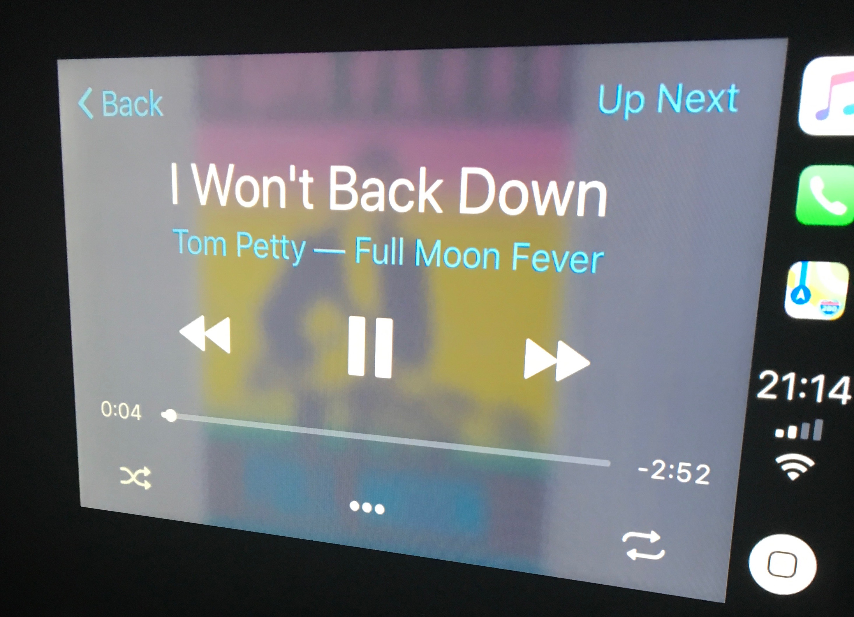
The emphasis is on big clear text and buttons. It was easy to tap when driving, to end a route map or to skip a song. The Ford screen is big, bright and easy to read. Here is an example of the Apple Maps app:
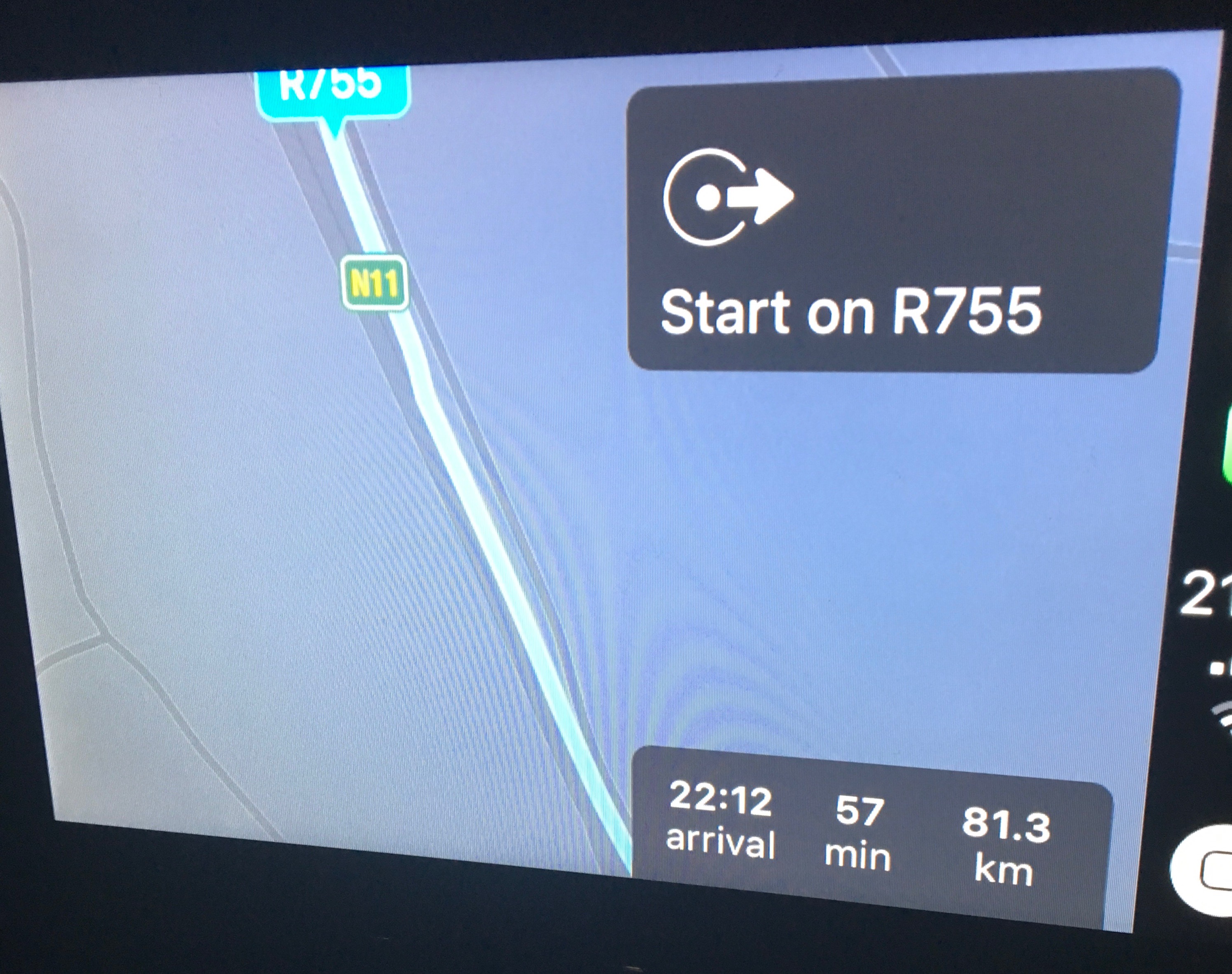
Given its position in the car, this is far better than using your phone on the passenger seat, or using a phone holder attached to your air vent!
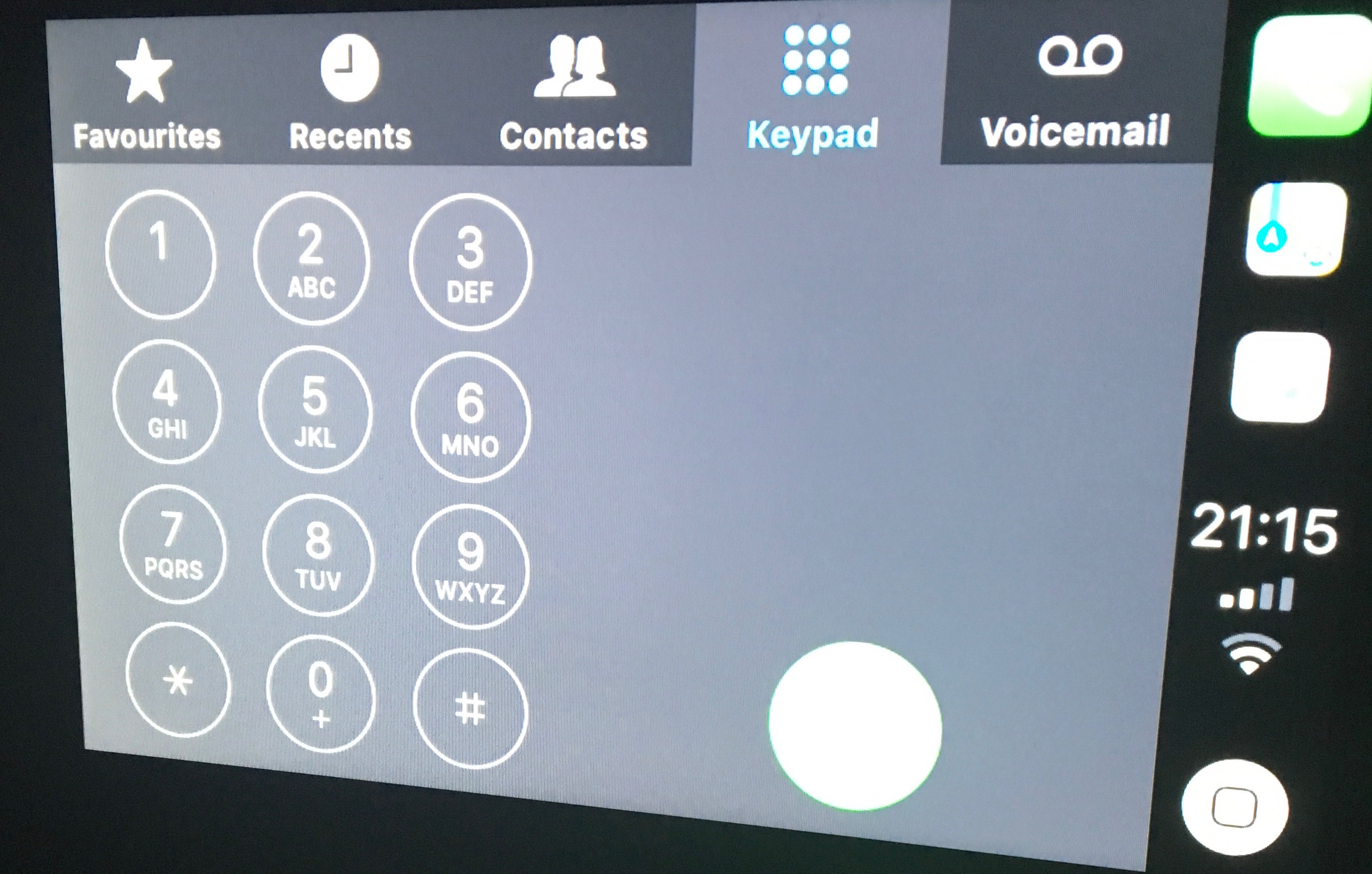
The Phone app is also clear and easy to use:
I found that using CarPlay was easy- there was almost no learning involved as the icons match the iOS experience. My seven-year-old immediately took to it when she sat into the car- she tapped and scrolled with ease, rarely stopping to consider how to use the system.
By comparison, the built-in Ford Sync menus are very ugly:
This is what you see when you exit out of CarPlay- a typical car manufacturer's UI. For me the contrast was remarkable. I have been using the older Ford Sync menus in my 2013 Ford for the last few years and the contrast is a leap from analogue to digital. This system just works; it is friendly, familiar and easy to navigate.
However the relationship with the car is transformed, and I can see why car manufacturers would be uneasy. The driver's connection with the car moves in Apple's direction- this feels like an Apple experience, not a Ford experience. It is still a Ford Car, but your relationship with the Ford brand is pushed aside. When you get into the car you plug your iPhone in and you touch the Apple iOS-driven screen. Apple is riding on top of Ford technology- this is a remarkable leap for the driver and one that I love. But Ford have surrendered their ground to a third-party invader and that is both welcome and curious.